Branding Project
South Mississippi Fair

Branding Project Outline
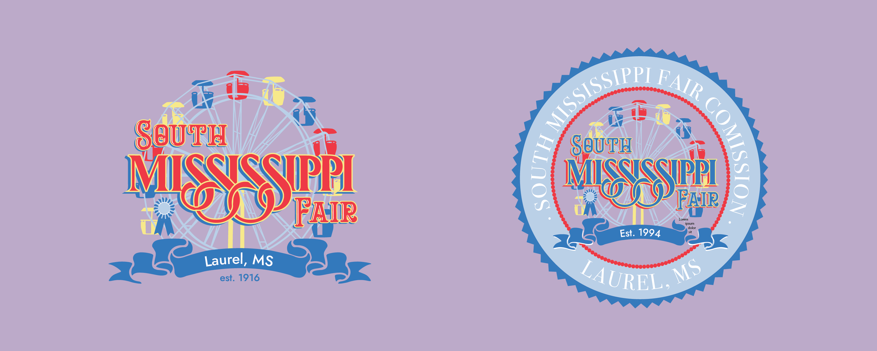
The South Mississippi Fair came to me in need of a logo. Since their beginnings in 1916 and 1994, neither the South Mississippi Fair nor the South Mississippi State Fair Commission have ever had an official logo. They were not consistent with branding, and their logos differentiated throughout the years. When they came to me, they specifically had icons in mind such as a Ferris Wheel and a state fair blue ribbon. I also drew the importance of a fun serif display typeface compared with the supported type of ribbon-edged sans serif from their inspirations. We also worked on the color palate together with two shades of blue in mind with complementary colors. The seal is essentially the South Mississippi State Fair logo breaking the boarder of a circular crest that drew its shape inspiration from the blue ribbon as well.
Branding Style Booklet
Commission Branding Style Addition
Branding Style Booklet
Commission Branding Style Addition
Branding Style Booklet
Commission Branding
Style Addition
Portfolio
Blog
Case Studies
Home
